Stock Management App
Manage large and complex orders and stocks in an intuitive way. The main goal was to fit all the information and a large number of items into one single app, so that users could easily contact the dealers and send their orders directly from the mobile app.
My role was to take the initial idea they had for the app and come up with a functional and intuitive UX, alongside with a simple and attractive UI that would easily be recognised by the target audience. Hence the use of common design patterns like the chat, making the app more intuitive, this way.
The problem
This app has a lot of information that needed to be displayed on mobile devices with medium to small screens. It's an all-in-one stock management and purchase for restaurants, bars, and other establishments.
One of the key components is that it uses the chat to make the orders. The user could send a message to his dealer contact and make the order right from there by choosing from his available stock.
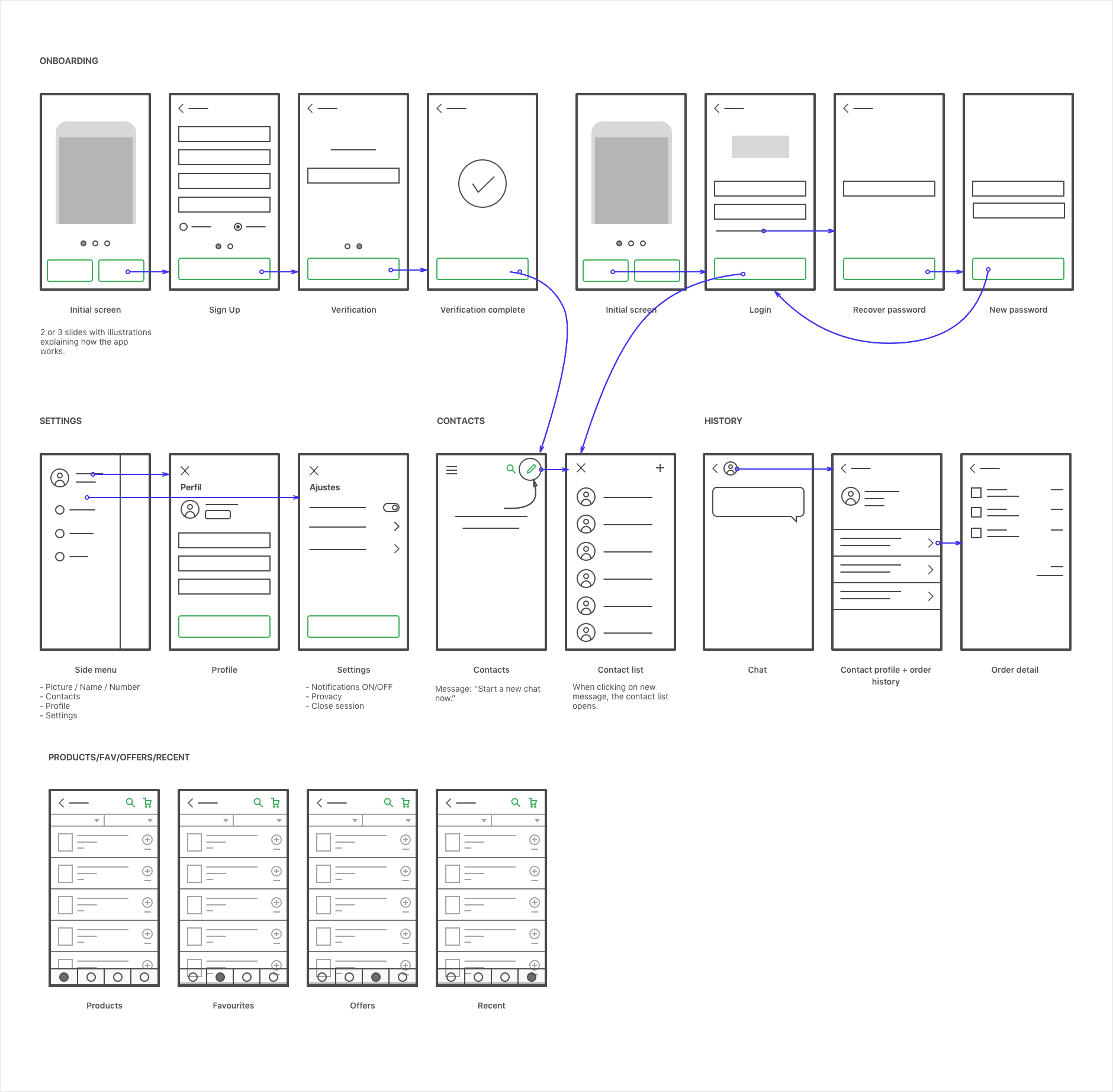 Main user flow divided into 3 main parts: 1) Onboarding, 2) Sign Up and Login and 3) Product interaction (orders, settings and profile).
Solution
The key screen on this app is the products screen. This is where all of the products will be shown to the user and where all of the shopping will be done, so this had to be carefully thought.
There were some iterations on designing this screen, where the main goal was to make it simple, usable and at the same time show as many products possible.
Putting together the product/catalog screen
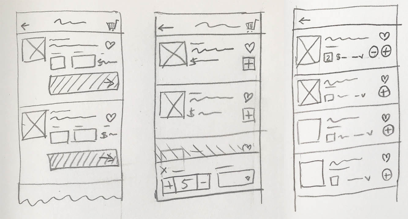
On the first iteration, although we add all the key information displayed and easy to access, it was taking too much space small mobile screens.
On the second iteration we removed the large CTA and added a simple "+" button. For the quantities and type we added a slide in popover that would appear when tapping the "+" button. Still this solution was requiring a lot of space and it was making the user to take a secondary step before adding the product to the cart.
For the last iteration, we removed the popover and added the "+" and "-" buttons that would automatically add the quantities of the selected product to the cart. The type of product set by default was the most common used by the user and it could be changed by using a simple dropdown.

