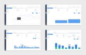
Leadfeeder Onboarding
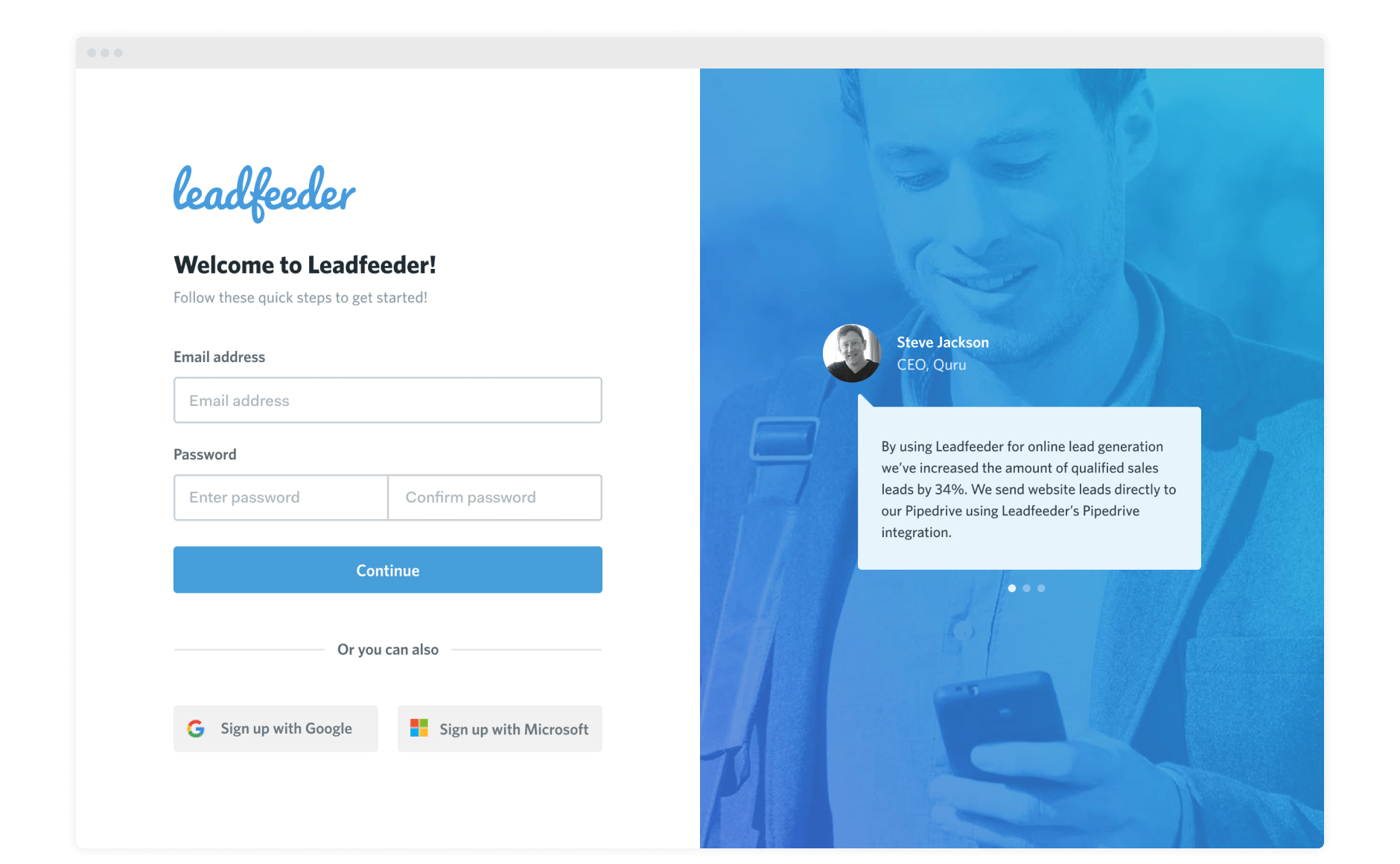
For this project I was in charge of simplifying the onboarding process as well as making it easy to navigate, understand and convert.
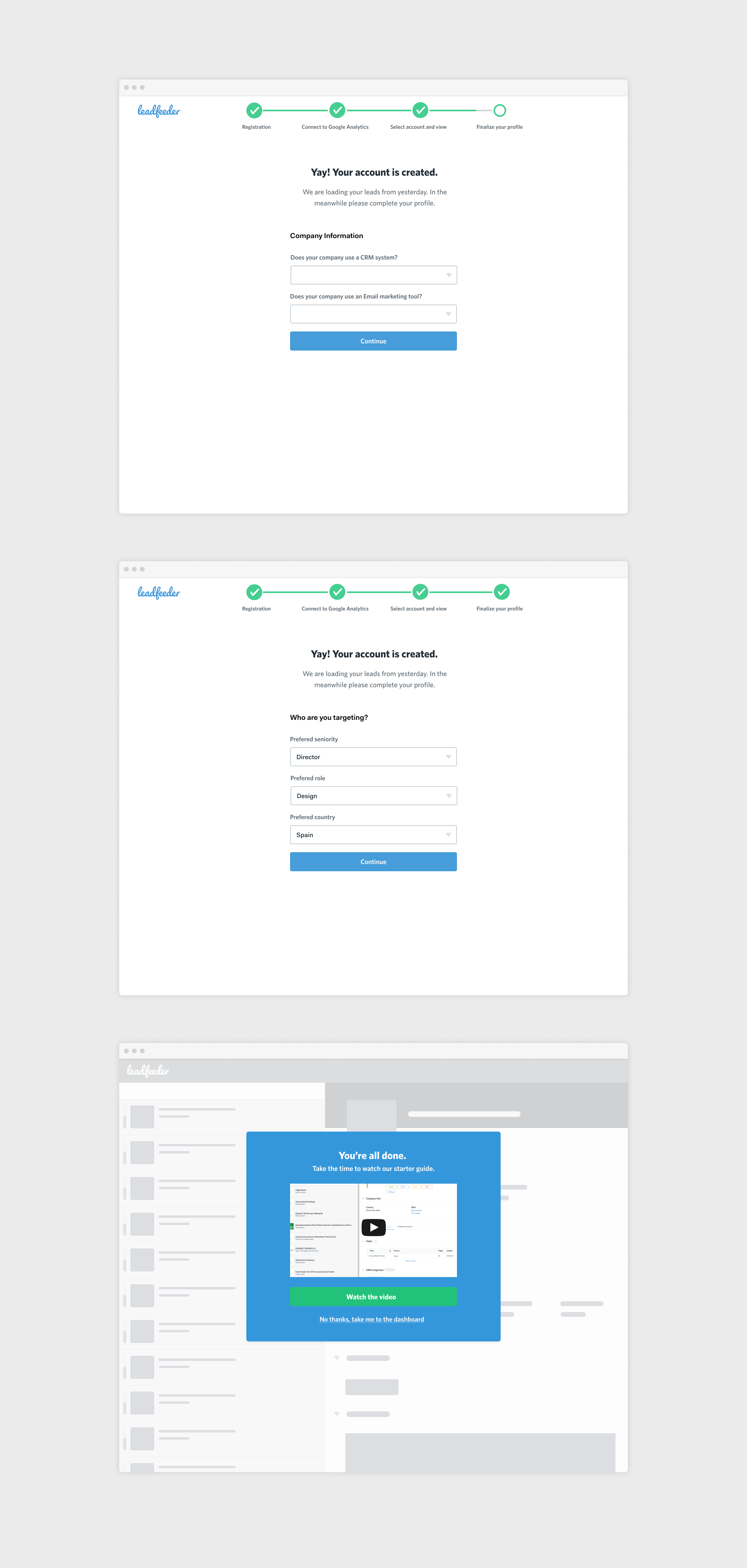
Main main goal after taking a look at their onboarding process was that it needed to have less information given to the user at one time. Having a form with 10 or more fields at a time could be tiresome and lead potential customer to bounce.
By having the forms distributed across screens and giving it a, somewhat, gamified experience it would make the process more pleasurable.
